What are Apple App Store’s screenshot requirements? A guide
Creating iOS screenshots that follow strict guidelines for Apple’s App Store is crucial for app success (not to mention approval). Median.co’s guide to app store screenshot guidelines provides specific sizes and tips for iPhone and iPad models, emphasizes the importance of clear, vibrant images that tell a visual story of your app, and outlines the requirements for App Preview videos and app icons. It also covers the App Store submission process (including asset preparation and handling rejections) to ensure you have a smooth review (and approval) process with Apple.
Creating an iOS screenshot for app store is a critical step in app promotion, but it’s not just about grabbing attention; it’s about meeting specific requirements.
This guide cuts through the confusion to deliver the exact sizes, specifications, and reliable strategies for producing iOS screenshots that fit App Store standards and attract potential users.
Key Takeaways
App submission to the Apple App Store requires that screenshots be provided for mandatory device sizes including the iPhone 13 Pro Max, iPhone XS Max, iPhone 8 Plus, and the 12.9-inch iPad Pro. These should be following specific file formats, resolutions, size requirements, and no transparency.
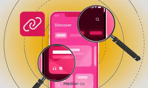
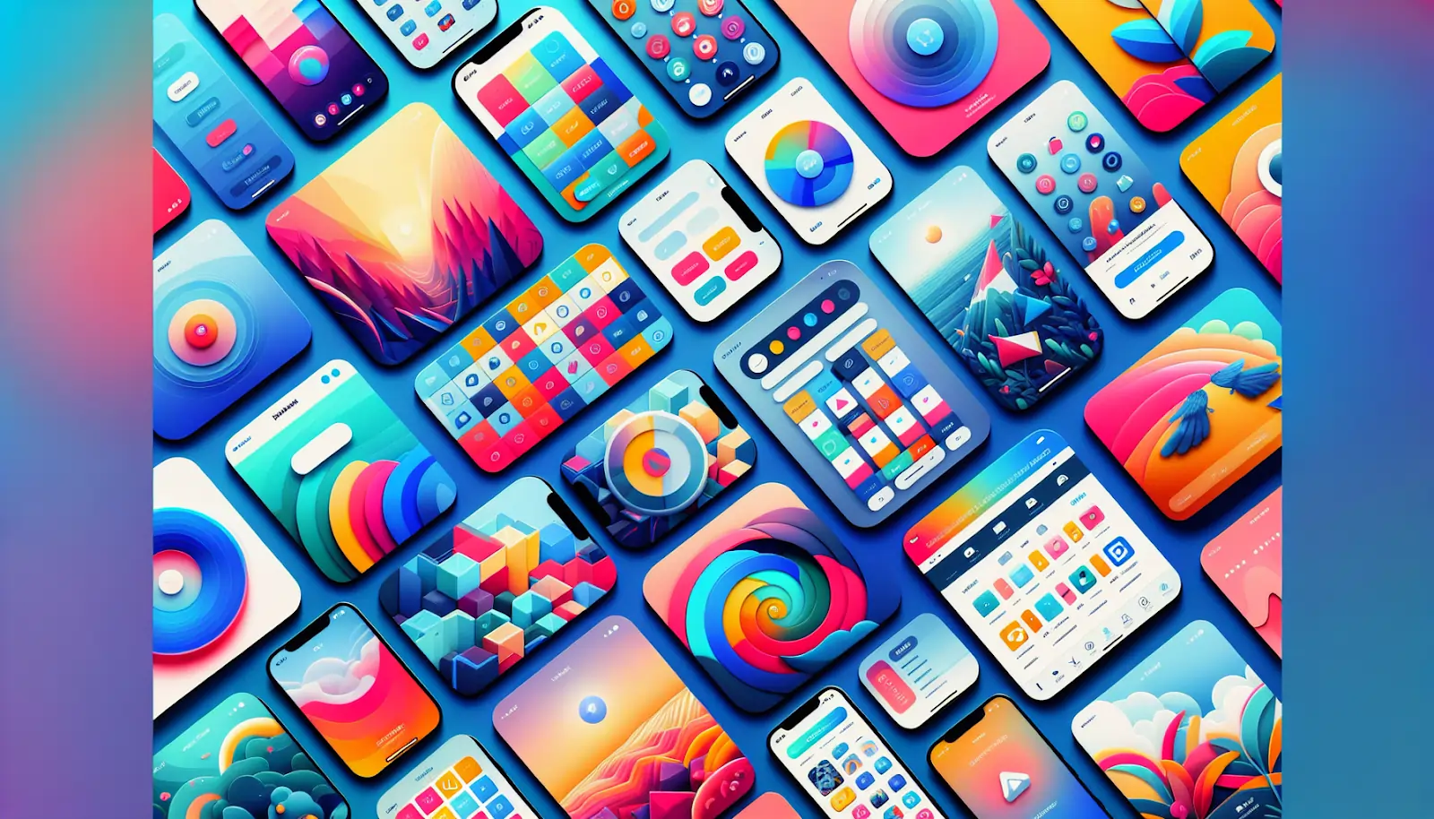
Effective App Store screenshots serve as a visual narrative of an app’s functionality and user experience, and should include in-context images, benefit-driven captions, highlights of key app features, and full use of all screenshot slots.
App Preview videos must adhere to Apple’s guidelines with specific format, resolution, and content focused on the app’s features, employing storytelling and visual appeal to provide potential users with an authentic insight into the app, and app icons should be simple yet effective to communicate the app’s purpose.
Enter any URL to build your app
Essential iOS screenshot sizes for the App Store
When presenting your app on the Apple App Store, it’s critical that app store screenshots are correctly sized. These visuals captured from your app need to align with the specified app store screenshot sizes for compatibility across diverse iOS devices and for proper display within the App Store.
The following device models require mandatory submission of screenshots when you’re adding an app to the Apple App Store:
iPhone 13 Pro Max
iPhone XS Max
iPhone 8 Plus
12.9-inch iPad Pro
Neglecting to submit individualized screens for each required size can lead to automatic resizing by using one of these provided default dimensions. This is not ideal since tailored images best represent what users will see in practice on their specific device screen sizes — focus especially on providing visuals matching both 6.5 inch and 5.5 inch versions if limited.
Tip: For a quick win in the visual department, ensure your app screenshots are vibrant and clear, capturing the essence of your app’s user experience in a single glance.
For those developing applications, be aware that iOS app screenshots must conform precisely to set parameters.
Acceptable file types include JPEG or PNG files without layers.
Maintain a standard pixel density for your screenshots, ensuring a resolution of 72 pixels per inch (PPI).
Files should have no transparent background features.
The file sizes must comply with Apple's specific requirements, which include submitting at least one set of screenshots tailored to iPhone models with corresponding display sizes.
Following Apple's guidelines is important for ensuring your webview app or hybrid app screenshots accurately represent what users will experience on their devices. These visuals not only need to meet app store screenshot requirements but also serve as an honest visualization of your app's capabilities through the App Store's preview mechanism, which is essential for setting the right expectations before users download and install your app.
Beyond the technical requirements, such as app testing requirements for compatibility and functionality, these guidelines are designed to help you present your app in the best possible light, fostering a clear understanding of its features and benefits.
Fact: App Store screenshots for iPhone devices must be submitted in specific dimensions that correspond to the device's screen size, and the first 2-3 images are crucial as they can appear in search results and influence download decisions.
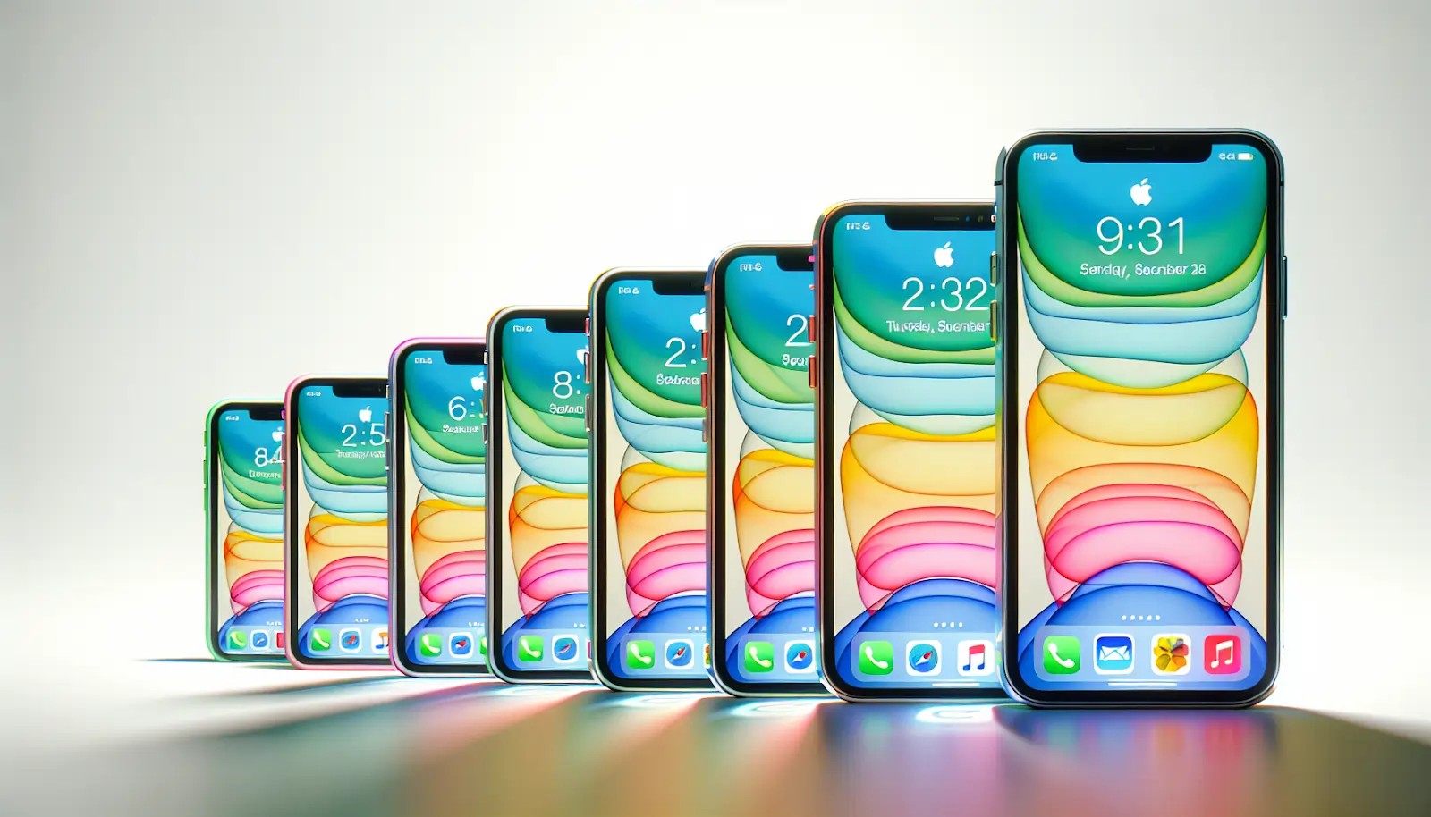
iPhone models
Let’s go over the necessary dimensions for screenshots on various iPhone models in the App Store.
For the iPhone 13 Pro Max, which features a 6.7-inch screen, portrait screenshots should be at a resolution of 1284 x 2778 pixels and landscape screenshots should be at a resolution of 2778 x 1284 pixels.
Different iPhone models require specific screenshot sizes, which are:
iPhone XS Max (6.5-inch display): Portrait - 1242 x 2688 pixels; Landscape - 2688 x 1242 pixels.
iPhone 12 Pro Max and iPhone 12 Pro (6.7-inch display): Both models require screenshots with the same dimensions, which are not specified here.
iPhone 12 Pro (6.1-inch display): Portrait - 1170 x 2532 pixels; Landscape - 2532 x 1170 pixels.
Adhering to these precise specifications for each individual iPhone model ensures an optimized user interaction across the different device formats within Apple’s ecosystem.
Tip: Always use the correct, screenshot size and dimensions for each iPhone model to ensure proper display on the App Store.
iPad models
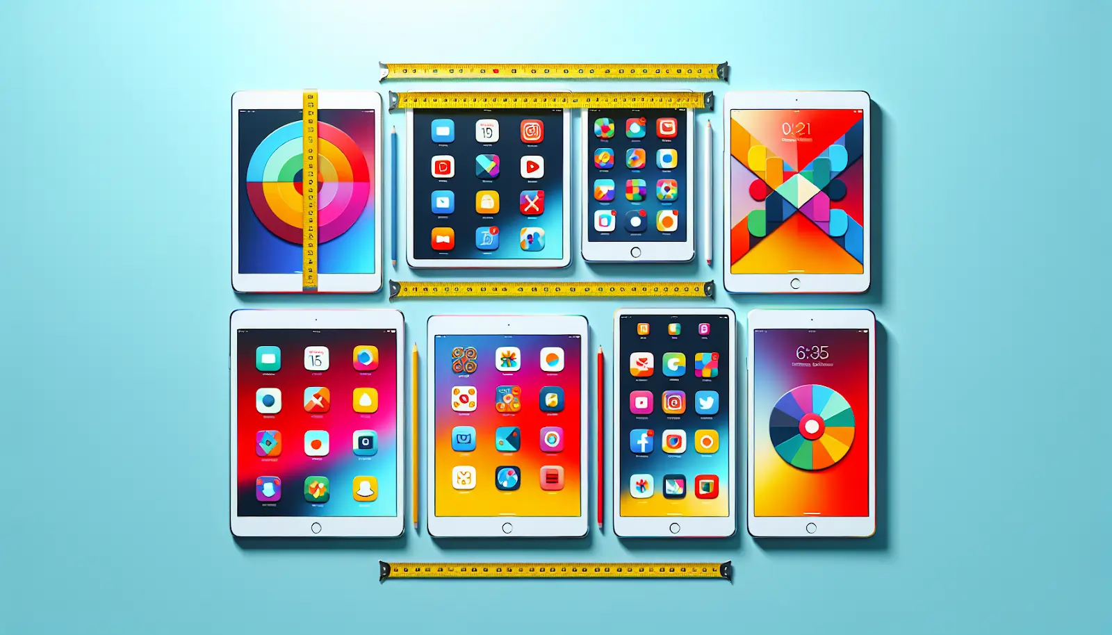
For the 12.9-inch iPad Pro (4th Gen), portrait screenshots should be at a resolution of 2048 x 2732 pixels and landscape screenshots should be at a resolution of 2732 x 2048 pixels. This ensures that images are displayed with crystal clear quality in either orientation.
The iPad Pro (11-inch) for both the third-generation and standard editions requires portrait screenshots to be 1668 x 2388 pixels and landscape screenshots to be 2388 x 1668 pixels.
Apple’s iPad Air and iPad Mini models also have specific requirements for screenshots to ensure they are tailored to each device’s screen dimensions and resolution capabilities.
By following these specifications, you can streamline the Apple App Store review time, making sure that your app's look and feel are accurately presented on the variety of tablets available in the App Store.
Tip: To make your app stand out, ensure that the screenshots for iPad models are sharp, clear, and effectively showcase the app’s design and functionality.
Creating effective App Store screenshots
Now that we’ve outlined the technical specifications for App Store screenshot sizes, let's talk about how you can create these screenshots.
These images are more than just visual — they're vital in showcasing your app's user experience and convincing visitors to become active users. To ensure your screenshots are visually appealing, apply some of the following fundamental design principles.
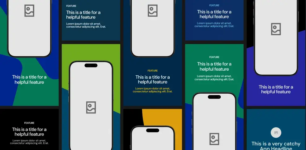
Use device mockups to display your app's interface against backgrounds that are free of clutter and which could otherwise divert attention from the features you wish to emphasize.
Uncertain about the best design approach? Use A/B testing to compare various designs and let user preferences on the App Store guide your final decision.
Tip: Use A/B testing to determine which screenshots result in better user engagement. Experiment with different visual elements to see what resonates most with your audience.
Tips for crafting impactful screenshots
To create App Store screenshots that captivate and inform, remember the following guidelines. These images are not just pictures; they're the first impression of your app's interface and experience. Adhere to these tips to ensure your screenshots are effective and memorable:
Strive to take real-time, contextual snapshots that authentically represent what users will encounter within the app.
Stitch together several images creating one expansive and eye-catching scene.
Ensure captions outlining benefits are clear-cut and large enough for easy legibility—highlighting why it’s advantageous to use this particular application.
When necessary, declutter UI components in order not only prioritize but also spotlight essential features within these static frames.
It is crucial that the initial two or three screenshots emphasize primary functions due to their prominent visibility upon first glance by prospective installers.
Take advantage of every available slot for uploading screen captures so as to uniquely exhibit the full breadth of functionalities offered through your creation.
Lastly, ensure while choosing imagery to upload some which accurately epitomize both distinctive facets alongside comprehensive usability inherent within said application.
Visual appeal
The likelihood of app store visitors installing an application rises when they are met with visually captivating screenshots that narrate the utility and prominent functionalities through their user interface presentations.
When crafting eye-catching images for app store screenshots, take into account these suggestions:
Employ the Rule of Thirds to get layouts that are both aesthetically balanced and inviting.
Opt for color schemes that not only please the eye but also align well with your app’s brand identity.
Explore landscape orientation to unveil more details within each image, which can foster a more immersive visual narrative.
Ensure captions on each screenshot stand out prominently and can be quickly read by viewers. They should highlight a key advantage or feature distinctively.
Merging vertical screens along with applying the A.I.D.A. methodology — a marketing model that stands for Attention, Interest, Desire, and Action — may enhance graphical components enough so as to grip potential users’ interest effectively.
Tip: Elevate your app's visual allure by ensuring screenshots are not only crisp and clear, but also tell a compelling story that captures the essence of your app's user experience.
Highlighting features
Ensuring that your app screenshots are not only visually captivating, but also clearly highlight the main features and advantages is essential.
The initial screenshot in the App Store must encapsulate what your app stands for, its core functionality, and convey to potential users exactly what they can expect from it.
Optimize each subsequent screenshot to focus on a singular standout benefit or feature so that you can showcase the unique selling points of your app concisely. It’s crucial for an app’s most prominent use cases to be displayed within the first three screenshots because these play a pivotal role in influencing potential users’ choices.
Tip: Highlight the main features of your app by using visual contrasts and annotations directly on the screenshots to draw user attention to the unique functionalities. Employ bold and concise captions to underscore the core benefits and distinguish your app from the competition.
Ensure there’s a balanced narrative across all screenshots which effectively summarizes how your app addresses user needs and outlines its overall benefits succinctly.
For instance, both Headspace and Calm have adeptly demonstrated this strategy by using their sequence of screenshots as storytelling tools — depicting engaging journeys through which prospective users visualize the experiences awaiting them with these apps.
Localization
Crafting effective screenshots for the App Store allows for a keen eye on localization, ensuring that your app appeals to a worldwide audience through adaptation to differing cultural contexts and linguistic preferences.
This is not just translating text within the screenshots so it is clear and understandable, but also adjusting all design components to align with the languages and cultural nuances of your target markets.
It’s imperative for these adapted App Store screenshots to mirror local cultural intricacies and user preferences in order to truly connect with users by considering their unique culture, customs, and demographic profiles.
Conducting thorough testing of these localized visual elements is essential in measuring their appeal against regional tastes — this step confirms whether or not your app’s imagery effectively resonates across various international landscapes.
Fact: Localizing your app's screenshots can significantly increase its appeal to global markets by ensuring cultural relevance and language accuracy.
App preview videos: Enhancing your app store listing
App Preview videos serve as a dynamic enhancement to your App Store listing, going beyond what static screenshots can convey.
They offer an effective means of driving up installation rates by giving potential users an authentic glimpse into the app’s practical experience. These engaging previews demonstrate the app’s functionality in real-time and help viewers understand its offerings more fully.
Creating these App preview videos follows strict guidelines set out by the App Store. The rules demand that only genuine footage from within the app is used, with a spotlight on showcasing its most enticing features while steering clear of any promotional elements or content that infringes upon copyright laws.
Video format and resolution
For the creation of engaging app preview videos, selecting an appropriate video format and resolution is critical. App previews can be uploaded in .mov, .m4v or .mp4 file formats and should adhere to either H.264 or ProRes 422 (HQ only) codec standards with mandatory resolutions such as 886 x 1920 pixels for portrait orientation and 1920 x 886 pixels for landscape mode on iPhone models featuring a display of 6.7 inches.
Regarding audiovisual requirements:
The audio component needs to use stereo sound using AAC codec at a bitrate of 256kbps coupled with a sample rate of either 44.1kHz or 48kHz.
Video bitrates are advised to be between roughly 10-12 Mbps if encoded in H.264.
A Variable Bit Rate (VBR) near about 220 Mbps is suitable for ProRes 422 (HQ).
The framerate must not surpass 30 fps.
Tip: For optimal audiovisual quality in your app preview videos, ensure that your audio track is clear, free from background noise, and well synchronized with the visual content to provide viewers with the most engaging and realistic preview of your app's features.
Specific parameters set forth for app preview submissions include:
A maximum permissible size limit of 500MB for the app preview file
An allowable duration that spans no less than 15 seconds but does not exceed 30 seconds
IOS app previews may present themselves in both portrait and landscape orientations. MacOS and tvOS restrict their views exclusively to the landscape format.
Content and storytelling
Ensuring that app preview videos are not only visually appealing but also rich in content and storytelling is key to differentiation. These previews should effectively showcase the primary features, functionality, and user interface of the app by leveraging the autoplay capability within the App Store, instantly drawing in users’ attention.
For maximum engagement, a tightly woven narrative complete with graphical enhancements, textual elements, and sound — limited to a crisp 15-30 second timeframe — is recommended for each app preview.
Tip: To captivate your audience, infuse your screenshots with the power of storytelling. Showcase the journey a user will experience, from problem to solution, through the features of your app. This approach not only engages users but also illustrates the value your app brings to their daily lives.
To refine your app previews include text that viewers can quickly understand mixed with superior audio quality which may feature voice overs or appropriate sound effects. Select an eye-catching poster frame representing your app’s core identity as this forms viewers’ first impressions on the App Store.
Authenticity is paramount. Ensure real-world usage of your application is depicted within these previews while transparently communicating any necessary disclaimers pertaining to purchases or account creation requirements.
Choose footage mindful of its longevity — it should avoid dating itself through references tied to particular events or seasons — to remain relevant regardless of the time passed since release.
Designing a stunning app icon

The initial touchpoint for users with your app is the icon, which captures their attention before they look at screenshots or watch app previews.
A well-designed app icon can effectively convey what the application offers and its benefits, making it pop among a sea of other apps on the App Store. It serves as a vital component in App Store Optimization (ASO), maintaining consistent representation across various facets of the store.
For an iOS application’s icon, 1024x1024 pixels is considered standard size.
Tip: When designing your app icon, remember that it's often the first element of your app that users will notice. Aim for a design that is recognizable even at smaller sizes, and test how it looks against different wallpapers and in various contexts to ensure it stands out.
Each platform might require different settings regarding corner radius and transparency. An iconic design that encapsulates your brand’s core attributes and reflects your app’s purpose can significantly enhance visibility.
By optimizing not just the app icon but also integrating improvements to the name, description, screenshots, and previews into one cohesive product page strategy, you’re likely to make a more impactful presence on the App Store.
App icon best practices
Creating an attention-grabbing app icon adds a balance between creativity and functionality. Here are some tips to help you create an effective app icon:
Focus on simplicity by highlighting a single object and eliminating clutter.
Ensure the app icon effectively communicates the app’s primary functionality to users, making the app’s purpose immediately apparent.
Include text in your app icon only when crucial for branding or user experience.
Prefer graphical elements over photos and standard UI components.
By following these tips, you can create an app icon that stands out and effectively represents your app.
Select colors that represent your brand identity and enhance visibility in search results, and decide on using a logo or a simple, descriptive icon based on brand recognition. Ensure your icon stands out from competitors and follows app store guidelines to prevent confusion.
Related Article What is a go-to market app strategy? How to build one in 7 steps
Platform-specific guidelines
It is crucial to ensure that while you maintain a consistent brand presence across multiple platforms, you also adhere strictly to the specific guidelines set out for app icon design on:
iOS
iPadOS
macOS
tvOS
watchOS
This means adapting your imagery and color schemes according to each platform’s unique style requirements:
iOS & iPadOS: Create full square images without margins or padding to accommodate various shapes and mask effects applied by the system.
macOS: Icons can have elements that extend beyond standard boundaries to illustrate app functionality. Aim for mimetic physical materials realism.
tvOS: Use layered graphics to add depth and movement. Logos and text should be distinct from background layers to enable engaging parallax animations on Apple TV interfaces.
Navigating the App Store submission process
Submitting your app to the App Store goes beyond simply clicking the ‘Submit’ button. It’s a process that requires careful preparation and consideration.
Developers must build their apps with the latest version of Xcode that supports the newest iOS SDK. As of April 2024, this is Xcode 15 and iOS 17 SDK.
Before submission, testing the app meticulously on the latest iOS release using both the Xcode simulator and physical devices is crucial to ensure compatibility and identify any functionality issues.
Using Apple’s TestFlight for beta testing to collect feedback and address any problems before the final submission to the App Store.
To submit the finalized app for review on App Store Connect, follow these steps:
Provide all necessary metadata for the app.
Make sure the app is prepared for the public launch.
Familiarize yourself with the App Store Review Guidelines to address the technical, content, and design criteria.
This will help in avoiding common issues and facilitating a smoother review process.
Fact: App submissions to the Apple App Store must include specific device screenshots and meet detailed guidelines. Thorough beta testing via TestFlight can streamline the review process for quicker user access.
Preparing your assets
Before starting the submission process, it’s crucial to have all your materials ready. This means following Apple’s specifications for app store screenshot dimensions and quality to guarantee they display correctly on various devices. Not meeting these requirements can postpone your app’s debut and its access to potential users.
If your app is designed with a Dark Mode feature, be sure to add a corresponding screenshot when submitting your assets.
Before uploading items such as screenshots to App Store Connect, make sure you’ve reserved space for them there. Once all parts of the asset are uploaded, confirm the upload completion so that App Store Connect can begin processing.
The verification steps for an uploaded asset include:
Ensuring file integrity by checking checksums
Confirming proper file format compliance
Verifying that screenshot sizes align with required standards
It’s imperative when designing screenshots not only to create visuals of the correct size, but also consider their layout and message thoroughly since this impacts download rates significantly — and then carefully manage their upload strategy.
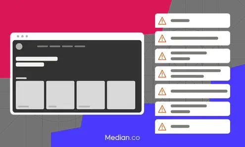
Handling rejections and resubmissions
Even with meticulous planning and hard work, there is still a chance that an app could be turned down. To facilitate an untroubled review by the App Store, acquaint yourself with the App Store Review Guidelines and examine frequent errors that may lead to postponements or denials of your app.
After you have submitted your app, pay attention to aspects such as validating uploaded assets and the potential need for scheduling specific time slots to finish uploads.
For both initial submissions and subsequent updates in App Store Connect, make sure you provide all required privacy details about your app so it adheres to standards. Also make sure to avoid images resembling Apple products within your app icons because this can result in copyright infringement concerns during the review phase for apps on the store.
Case studies: Successful App Store screenshots
Case studies of successful app store screenshots reveal diverse tactics tailored to specific audiences and app functionalities:
Dropbox highlights its ease of use and features through annotated screenshots that guide users through its in-app experience.
Clash of Clans stirs up excitement with action-packed graphics and characters, showcasing the game's vibrant environment.
Popular platforms like TikTok, YouTube, Instagram, and Uber opt for a minimalist approach, using white backgrounds and succinct text to ensure their screenshots are impactful and memorable.
Sports and entertainment apps such as ESPN and Twitch, as well as reading and lifestyle apps like Marvel Unlimited and Planta, employ a panoramic landscape layout that stitches together multiple screens to create an illusion of a continuous, expansive image — a strategy that captures the attention of potential users effectively.
Hulu differentiates itself with striking landscape screenshots, enhancing its discoverability amidst a crowded App Store.
In the competitive realms of Apple TV and Apple Watch apps, standout presentation is crucial, with various screenshot types, including those that effectively represent the app on Apple TV, playing a key role in capturing user interest.
These case studies show that there's no one-size-fits-all approach to designing compelling App Store screenshots. Success relies on a deep understanding of your app and its target audience, and then crafting a visual narrative that resonates with those users.
Instant app store facelift. No designer required.
Unlock Median’s 500+ free Figma app store screenshot templates designed to meet iOS and Android guidelines. Your app will look its best across platforms, resulting in more downloads and a more powerful app store presence.
Summary
Grasping the art of iOS App Store screenshots is a blend of art and science, requiring adherence to technical specifications and the crafting of visually appealing images. It's about understanding the mandatory device sizes, such as the iPhone 13 Pro Max and 12.9-inch iPad Pro, and ensuring that screenshots are vibrant and clear to effectively showcase an app's user experience. App Preview videos and app icons also play significant roles in enhancing an app's presence on the App Store, with each requiring strict adherence to Apple's guidelines for format, resolution, and content.
The submission process to the App Store is meticulous and demands a thorough preparation that includes beta testing, localization, and ensuring all assets meet Apple's requirements. Successful app listings often employ a compelling visual narrative that resonates with potential users, encouraging downloads and engagement. Case studies of successful apps underscore the importance of a customized approach to screenshots that aligns with the app’s functionality and target audience. Ultimately, the goal is to transform the App Store listing into a powerful tool that not only meets Apple's stringent guidelines but also captures the essence of the app and communicates its value to potential users.
Frequently asked questions
What screenshots are required for the App Store?
When submitting screenshots to the App Store, ensure they are formatted as PNG or JPEG files, or in video format. These visuals must conform to the dimensions of a 6.7” iPhone, a 5.5” iPhone, or a 12.9” iPad for proper display.
What size screenshot for App Store 2023?
The screenshot dimensions for the App Store must adhere to a format of JPEG or 24-bit PNG without alpha, and be presented in a landscape orientation of 16:9 or portrait configuration of 9:16. The pixel range should span from 320 to 3840 while ensuring that file size does not exceed the threshold of an 8-MB maximum.
What is the importance of visually-appealing App Store screenshots?
Screenshots that are visually attractive play a critical role as they forge a robust visual bond with the viewers, underscore brand presence, and proficiently highlight the functionalities of an app. These elements can greatly influence both the number of app downloads and the level of user interaction.
What are the video format and resolution requirements for app preview videos?
App preview videos must adhere to format requirements, which include.mov,.m4v, or.mp4 file types and use either H.264 or ProRes 422 (HQ only) encoding. They should be created in resolutions that correspond with various iPhone models.
How can I create an effective app icon for my app?
For crafting a compelling app icon, it is essential to prioritize simplicity and ensure that it conveys the core function of your app. Refrain from incorporating superfluous text and opt for color schemes that are representative of your brand’s identity, thereby enhancing recognition and distinction for your application.
What factors affect Google Play review time?
When submitting an app to Google Play, the review time can be influenced by several factors including the complexity of the app, the accuracy of the content rating, adherence to Google's policies, and the overall quality of the app submission. However, using an app builder such as median.co can streamline the process significantly.
Median.co offers a user-friendly platform that simplifies the app development process, allowing you to design, build, and submit your app to the Google Play Store efficiently. The tools provided by the app builder ensure that your app meets Google's guidelines, which can help in reducing the review time. Additionally, Median can manage the submission process on your behalf, ensuring that all the necessary details are accurately filled out, which is crucial for a quick and successful app review. By leveraging the expertise of an app builder, you can focus on creating a high-quality app while the technicalities of submission and review are taken care of.