Apple’s UI do’s and don'ts: Formatting content
Create effective iOS apps by following Apple’s UI guidelines on formatting content. Some key strategies covered in this blog include ensuring content visibility, optimizing your app’s touch controls, maintaining a consistent visual experience throughout the app, and proper spacing. Use SwiftUI and Auto Layout to dynamically adapt an app across various Apple devices including iOS, iPadOS, tvOS, visionOS, and watchOS. Support Dynamic Type feature to adapt any text-size changes and preview apps on multiple devices — and include A/B testing strategies to learn about user preferences.
To create effective apps for Apple devices, it’s important to follow Apple’s UI do’s and don'ts on formatting content.
These guidelines ensure your app is visually consistent, user-friendly, and accessible across all Apple platforms.
This article will cover key principles from Apple’s Human Interface Guidelines (HIG), including content visibility, touch controls, text legibility, readable contrast, and spacing.
Let’s break down Apple’s very own UI do’s and don’ts on formatting content to ensure a smooth mobile app experience.
Enter any URL to build your app
Layout

Source: Apple’s UI do’s and don’ts
Apple’s guidelines state that the layout must fit the screen of any device type it’s operated on, removing the need for zooming in or scrolling through content horizontally.
Maintaining a consistent layout ensures your app is usable across various devices and contexts, ensuring an ever smoother user experience.
Adaptability
Adaptability is key for an effective app layout that remains consistent within all Apple devices, be it iOS, iPadOS, tvOS, and visionOS. All these devices have different visual layout requirements that determine how your app will look in the end.
To ensure a consistent layout, use SwiftUI or Auto Layout for a dynamic adoption of contextual changes that may occur with different device types.
Your app is considered a user friendly app if its layout adapts gracefully to context changes while remaining consistent with your branding.
Think of the times you used an app on an iPhone vs. an iPad — has there been any visual inconsistencies? Did the app adapt well on both devices?
For an app to be consistent and gain user loyalty, it has to be adaptable on all devices, you can do this by ensuring your app’s interface adapts to any system-defined safe areas, margins, and guides.
Text sizes
When thinking of adaptability, text size changes should be top priority. Undoubtedly, people are changing text sizes on their devices
You can make your app adaptable to text size changes by supporting Apple’s Dynamic Type feature, this ensures people can see different sizes of any visible text in iOS, iPadOS, tvOS, visionOS, and watchOS.
Previews
Previewing your app on multiple devices is important for ensuring your app meet’s Apple’s guidelines on visuals. Use different orientations, localizations, and text sizes to preview your app.
A/B test your iOS app with versions that use the largest and then smallest layouts. This will show you what works for your app and saves you time on excessive testing.
Artwork
Artwork is important for an app, especially for consistent brand recognition, you need your app’s artwork to be adaptable.
You can ensure artwork adaptability by scaling your artwork to display changes efficiently.
Think of the time when you’re watching Netflix on your phone, and suddenly move around, indirectly changing the screen’s aspect ratio from Landscape to Portrait — which in return crops your screen — Apple doesn't want that for apps.
Visual hierarchy
Visual hierarchy simply means showing what’s important at the top of your screen. According to Apple’s guidelines, people tend to view visuals in reading order — from top to bottom, and from the leading to trailing side.
This means your visuals will work best if the most important information is near the top and leading side of the window, display, or field of view (the space they can see without moving their head).
Here are 5 visual hierarchy tips from Apple you can follow when formatting content:
Make sure all important information about your app is easy to find by giving it sufficient space — be concise and reduce clutter.
Use negative space, background shapes, colors, materials, or separator lines to clearly organize information.
Align your text properly and in an organized manner so that the visual aspect of your app looks clean and easy to navigate.
Add visual indicators to show people where they can find information that is currently hidden.
Provide enough space between interactive components, making it easier to discover.
Guides and safe areas
Layout guides
Apple’s layout guide defines a rectangular region that demonstrates how you should position, align, and space your content on screens.
Each device’s system includes layout guides that ensures ease of application to standard margins around content and basic restrictions against the width of text for readability.
For developer guidance, see UI Layout Guide and NS Layout Guide.
Safe areas
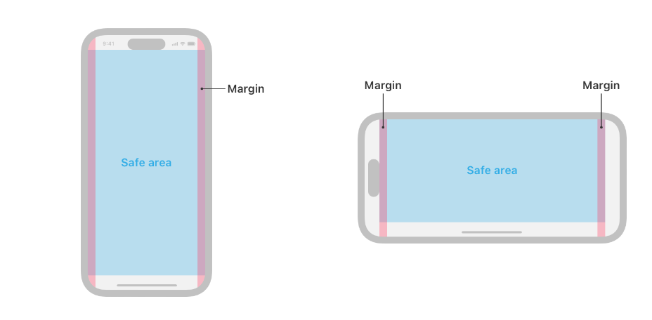
Source: iPhone safe areas as displayed by Apple
Apple defines a safe area as the view that isn’t covered by a navigation bar, tab bar, toolbar, or other views a window might provide.
Safe areas allow your app to avoid a device’s interactive and display features, making for a smoother visual experience.
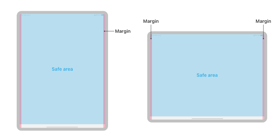
Source: iPad safe areas as displayed by Apple
Safe areas can be useful for interactive elements such as navigation bars — it makes sure they dynamically change with the changes made in content size.
For developer guidance, see Positioning content relative to the safe area.
What are Apple’s specific platform considerations
iOS
Apple’s guidelines state that developers should aim to support iOS apps in both portrait and landscape modes.
Think of gaming apps and streaming apps where users are inclined to use both modes at some point during their in-app activities.
If you’re planning to include just one mode, A/B test your app to figure out which orientation app users prefer for your app.
When thinking of visual content for iOS, ensure background and full-screen visuals extend to the edges of the display, this provides a cohesive visual experience for your overall app.
iOS keyboard layout guide
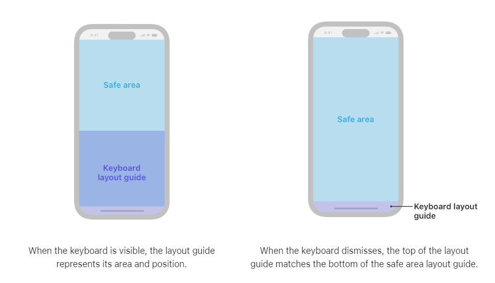
Source: iOS keyboard layout screenshots from Apple
For iOS devices, Apple has provided a keyboard layout guide that indicates where the space of the keyboard currently occupies and the safe area insets.
The keyboard layout should not take over the entire screen, for a seamless user experience ensure your app’s keyboard effortlessly takes enough space for the screen to be visible to the users.
The keyboard should also smoothly come into the screen, and leave the screen as per the needs of the user.
For developer guidance, see UI Keyboard Layout Guide.
iPadOS
Apple has specific guidelines for iPad’s content formatting. Some highlights:
For easier reachability, place app control features on the sides of the screen to avoid clutter in the middle part of the screen — this ensure an easier app navigation system
Don’t put custom content or even controls in the center of the status bar for people that multitask multitasking or Stage Manager.
Don’t place interactive controls at the bottom edge of the screen — this makes it harder to access features like the Home Screen and App Switcher.
Place controls in the lower portion of the screen, just below the safe area — this ensures easier accessibility.
Dynamically reposition the content as needed by setting different status bar heights — you can achieve this by using the safe areas of your iPad’s display range.
Other platforms
Apple has set guidelines for other platforms such as the macOS, tvOS, visionOS, and the watchOS. Some of these guidelines include:
macOS: For macOS, avoid placing important information or controls your window’s bottom and its camera housing area.
tvOS: Have different layouts for various TV sizes, make sure to follow their specific safe zones and use padding for elements that requires a considerable amount of focusing.
visionOS: Center your important content, keep window content within the screen’s limitations, and make sure interactive components are easy to locate and use.
watchOS: Extend your content edge-to-edge, make sure side-by-side controls are limited to two or three controls, and consider minimizing the padding between elements.
Want to know how it all works?
Get hands-on with Median’s comprehensive documentation, and build your app with ease.
Summary
To ensure app efficiency across all Apple devices, it is important to follow Apple’s UI guidelines on formatting content, ensuring consistency, user-friendliness, and accessibility.
Use SwiftUI or Auto Layout to create a consistent layout across various Apple devices. Make sure your app’s support Dynamic Type to adapt to the changes in text-sizes.
Preview apps on multiple devices before publishing your app to the App Store — and conduct A/B testing to check what screen orientation fits best for your app.
Practice visual hierarchy for displaying content by placing important information at the top of the screen, declutter your app with negative spaces.
Following these guidelines when planning your app’s content will ensure a smoother user experience and a guaranteed App Store approval for any type of apps, be it a webview app or a native app.
Frequently asked questions
What are the key principles of Apple's Human Interface Guidelines (HIG)?
Apple’s Human Interface Guidelines emphasize creating user interfaces that are visually consistent, user-friendly, and accessible. Key principles include ensuring content visibility, optimizing touch controls, maintaining readable contrast, and proper spacing.
Why is the safe area important in app design?
Safe areas ensure that your content is not obscured by navigation bars, tab bars, toolbars, or other interface elements. They dynamically adjust based on the device and orientation, ensuring your app's content remains visible and accessible across all Apple devices.
How does proper alignment enhance the user experience?
Proper alignment helps create a clean and organized interface, making it easier for users to navigate and interact with the app. It enhances readability, guides the user's eye through the content, and contributes to a polished and professional appearance.
What are the benefits of adequate spacing in app design?
Adequate spacing between elements prevents visual clutter and makes the interface easier to navigate. It ensures touch targets are easily accessible, helps users differentiate between interactive and non-interactive elements, and creates visual breathing room.
How can developers ensure readable content in their apps?
Developers should use a minimum font size of 11 points, employ Dynamic Type to allow users to adjust text size, and maintain high contrast between text and background. Using accessible fonts and avoiding overly decorative typefaces also enhance readability.
Why is adaptability crucial in app design?
Adaptability ensures that the app provides a consistent experience across different devices and orientations. Using tools like Auto Layout and SwiftUI helps create responsive interfaces that adjust smoothly to various screen sizes and aspect ratios, ensuring optimal performance on all Apple platforms.

Related articles