Apple's app branding guidelines, documented in its Human Interface Guidelines, cover voice and tone, accent color, custom fonts, logo and launch screen use, and a full color system for light mode, dark mode, and accessibility. Following them gets your app through App Store review faster and builds the consistency that makes people trust it enough to keep using it.
Apple's app branding guidelines cover how your app communicates through voice and tone, and how it uses color to guide people through the interface.
The guidelines are part of Apple's Human Interface Guidelines. Following them helps your app get through App Store review faster, since Apple's reviewers check your app against these standards. It also builds the kind of brand consistency that makes people trust an app enough to keep using it.
See how Median App Studio brings your brand to life from app icons and splash screens to native navigation and custom app experiences.
Instant Preview
Enter any URL to build your app
Why app branding matters beyond passing review
A branded app does more than make it look put together. Strong branding is what separates an app people remember from one they forget about or delete after a single use.
First impression
Your app competes for attention in the App Store before anyone opens it. A recognizable app icon and a consistent color scheme help make someone stop scrolling and tap install.
Trust
Consistent branding signals that an app is maintained and built with care. That matters most when you're asking someone to pay for something in-app, since people don't usually hand over a credit card to something that looks unfinished.
Engagement
A consistent interface, consistent marketing, and consistent in-app messaging make an app easier to use. Ease of use is what keeps people coming back, not uninstalling after the first session.
Marketing
A brand you can describe in one sentence is a brand you can market. Inconsistent branding makes each campaign harder, because you're re-explaining what the app is each time instead of building on what people already recognize.
Tip: If you can't describe your app's brand personality in one sentence, fix that before you touch the marketing plan. Everything downstream gets harder without it.
What Apple's Human Design Interface Guidelines say about app branding
Apple publishes its own branding standards in the Human Interface Guidelines. Following them isn't optional if you want your mobile app to make it through the Apple App Store review process.
Apple's three UI design principles
Everything below traces back to three principles that Apple bases its Human Interface Guidelines on: clarity, deference, and depth.
Clarity. Legible text, obvious actions, and no clutter, so people understand what they're looking at without extra effort.
Deference. The interface steps back and lets your content lead, using whitespace and clean typography instead of decoration.
Depth. Shadows, scale, and contrast that show people what's interactive and what's just backdrop.
Voice and tone shape how people perceive and interact with your app before they've formed any other opinion of it.
"Voice" is your app's personality, the values and style behind every piece of copy it shows.
Tone is the emotional adjustment layered on top of that voice, and it shifts depending on who's reading and what's happening. A new user landing on your onboarding screen expects a welcoming experience. A returning user hitting an error screen expects something direct, not cheerful.
Apple expects voice and tone to be consistent across all written communication in your app (not just the marketing copy around it).
How to choose an accent color for your iOS app
Your accent color is what makes buttons, links, and icons findable at a glance. It's as much a navigation tool as a design choice.
For iOS apps, your accent color should complement your app's primary color palette and provide enough contrast to stay accessible and clear.
Apple treats simplicity as the goal here. You specify a single color that the system applies consistently across interface icons, buttons, and text, rather than picking a different accent for each screen.
Should you use a custom font in your iOS app
A custom font gives your app personality and helps it stand out in a crowded App Store. It's also one of the easier ways to make a generic-feeling app feel more designed.
Apple asks that any custom font remain legible at all sizes and support accessibility features such as bold text and larger type settings. The most practical move is to mix custom and system fonts rather than replacing Apple's type entirely.
Use your custom font for headlines and subheadings, where personality matters, and keep Apple's system font for body copy and captions, where legibility at small sizes matters more.
How much branding content your app should show
Branding content works best in balance, a mix of visual and textual elements that represent your brand without taking over the screen.
Apple specifically recommends against using screen space for elements that serve only to display brand assets, such as logos. Every pixel spent on a static logo is a pixel not spent on the content someone opened your app to see.
Your branding should sit in the background of the experience, not interrupt it.
Why consistent pattern usage matters
Pattern usage covers the design conventions behind your app's interface, navigation, layout, and interactions.
Apple's guidance here comes down to comfort. Using the same patterns consistently throughout your app builds familiarity, and familiarity is what makes an app feel easy to use on the second visit, not just the first.
Where your logo should and shouldn't appear
Your logo is one of the most important visual signals of your brand, and getting its use right matters for App Store approval.
That said, the common mistake is overusing it. Avoid displaying your logo throughout the app. Users already know which app they're in. They don't need a reminder on every screen.
Apple recommends putting that space to better use instead, showing information and controls that help the person using your app.
What to do (and not do) with your launch screen
A launch screen appears the moment your app opens, and its job is to smooth the transition while your app loads, not to sell your brand.
Because a launch screen appears and disappears too quickly to include more than a welcome message, resist the urge to turn it into a branding opportunity. A launch screen built around heavy branding reads as amateur rather than polished.
Keep it simple, and let your app's actual interface do the branding work once it loads.
How to use color in your iOS app design
Color builds visual hierarchy, reinforces brand identity, and, done right, keeps your app readable and accessible. Here's what Apple recommends for color in iOS and iPadOS apps.
Best practices for color in iOS apps
Use color sparingly in non-game apps
Overusing color in a non-game app muddies your messaging and pulls attention away from what matters on the screen. Reserve color for the features that need to stand out.
Don't reuse the same color for different elements
Consistency depends on color meaning one thing. Using the same color to highlight unrelated elements leaves people guessing what's important.
Design for both light and dark mode
Your app's colors need to hold up in both contexts. Dark Mode leans toward darker palettes, with greater vibrancy on the elements that matter most. System colors adjust automatically for light and dark, which is one more reason to use them instead of hardcoded values.
Test under different lighting conditions
Colors read differently outdoors in direct sun than they do indoors under dim light. Account for where your users are when they're using your app, not just how it looks on your monitor.
Test across multiple devices
True Tone display adjusts the screen's white point based on ambient light. This matters most for apps built around reading, photos, video, or games, where you can control True Tone behavior by setting an adaptable white point style.
Account for artwork and translucency
Artwork and translucent elements shift the colors around them. Adjust as needed to keep the interface consistent and stop elements from overpowering or washing out against their surroundings.
Default to system-provided color controls where you can
Built-in color pickers provide a consistent experience and let users save color sets they can reuse across apps.
Tip: Test your dark mode palette on an actual device outdoors before you ship it. Simulator previews and studio lighting can hide contrast problems that show up the moment someone's outside.
Inclusive color best practices
Don't lean on color alone to convey important information, differentiate objects, or signal that something's interactive. Build in an alternative (a label, an icon, or a shape) for users with color blindness who won't pick up on color-only cues.
Avoid color combinations that lower contrast between content and background. Low contrast makes text and icons blend into the interface, which is a readability problem for everyone and a bigger one for users with color blindness.
Color also carries cultural meaning. What reads as positive in one country can read as a warning in another, so it's helpful to check how your palette resonates outside your home market before you lock it in.
System color best practices
Avoid hardcoding system colors into your app. Apple updates them over time, and a hardcoded value won't keep up. Use Apple's color APIs instead, which keeps your app's colors consistent as the system evolves.
Apple maintains its own dynamic system colors for iOS, iPadOS, visionOS, and macOS, built to match standard UI components and adjust automatically for light and dark mode. Since these dynamic colors can shift with updates, don't try to replicate them manually. Reference the system value instead.
Background colors for iOS and iPadOS
Apple defines two sets of dynamic background colors, system and grouped, each with primary, secondary, and tertiary variants that signal information hierarchy.
Use grouped background colors for grouped table views:
systemGroupedBackground. Main background of a grouped interface. UIKit property: class var systemGroupedBackground: UIColor { get }
secondarySystemGroupedBackground. Content layered on the main grouped background. UIKit property: class var secondarySystemGroupedBackground: UIColor { get }
tertiarySystemGroupedBackground. Content layered on the secondary grouped background. UIKit property: class var tertiarySystemGroupedBackground: UIColor { get }
Use system background colors for everything else:
systemBackground. Main background of your app's interface. UIKit property: class var systemBackground: UIColor { get }
secondarySystemBackground. Content layered on the main background. UIKit property: class var secondarySystemBackground: UIColor { get }
tertiarySystemBackground. Content layered on the secondary background. UIKit property: class var tertiarySystemBackground: UIColor { get }
Across both sets, primary gives you the overall view, secondary groups content within that view, and tertiary groups content within secondary elements.
Foreground content, text and other elements, is defined with dynamic colors too, so it stays readable against whichever background it lands on.
Default system colors for iOS and iPadOS
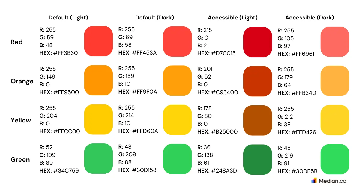
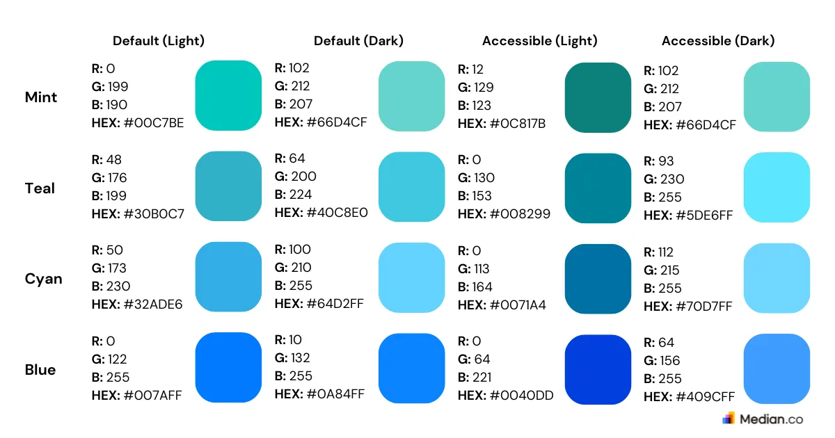
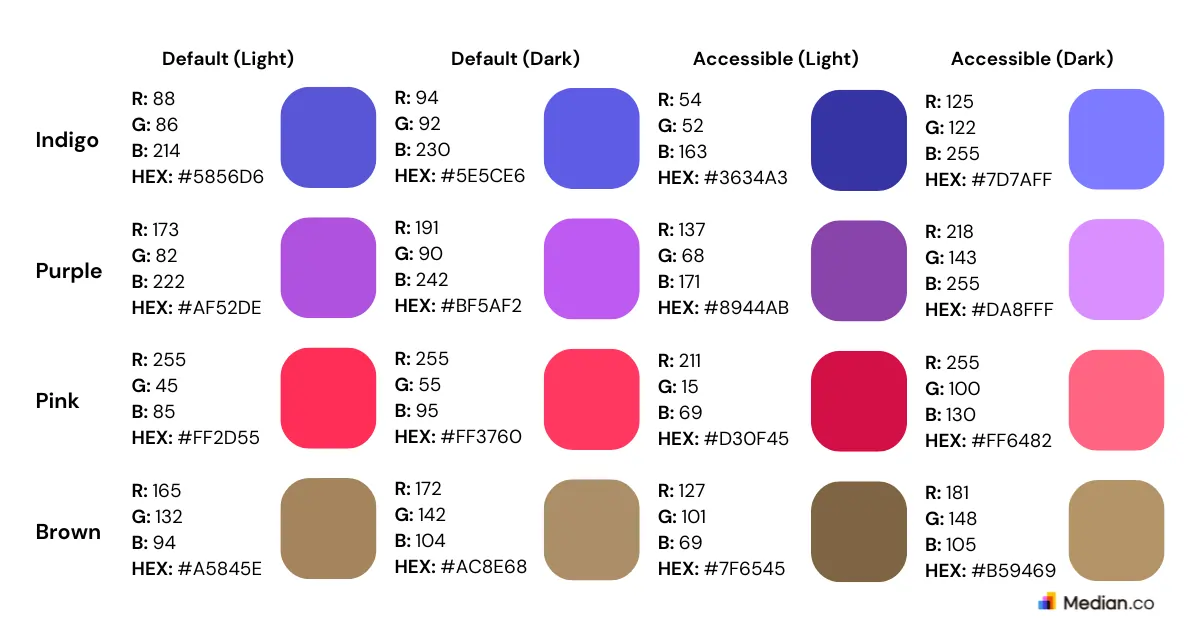
Apple's system color palette adjusts based on context, so the same named color can render differently depending on where it's used.
The full set: red, orange, yellow, green, mint, teal, cyan, blue, indigo, purple, pink, and brown, each available through SwiftUI as static let [color name]: Color.
System grey colors for iOS and iPadOS
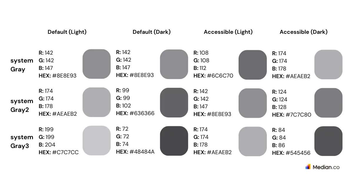
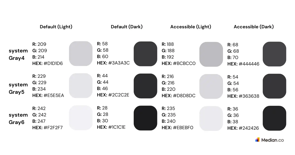
Apple also provides six levels of adaptive grey, from systemGray through systemGray6, each available through UIKit as class var systemGray[N]: UIColor { get }. Each level adapts automatically to the surrounding environment, so use the grade that matches the hierarchy you're building rather than picking one grey and reusing it everywhere.
Apple app branding: do's and don'ts
Here's a quick-reference version of everything above, plus where to go for Apple's design assets.
Do:
Define one clear voice for your app and adjust tone by context, welcoming for onboarding, direct for errors
Pick one accent color that complements your primary palette and holds up in both light and dark mode
Mix a custom font for headlines with Apple's system font for body copy
Use Apple's system color APIs instead of hardcoded values
Test color and contrast on a real device outdoors, not just the simulator
Pair color with a label, icon, or shape so interactive elements work for users with color blindness
Keep your launch screen to a simple welcome message
Don't:
Don't repeat your logo across every screen (once is enough)
Don't turn your launch screen into a branding moment
Don't use the same color to highlight unrelated elements
Don't rely on color alone to signal that something's interactive
Don't hardcode system colors or greys because they change with platform updates
Don't skip testing under different lighting conditions before you ship
For downloadable assets and the current specification sheet, Apple maintains its own Design Resources page with the official color values, templates, and UI kits by iOS version.
Try it for free!
Enter any URL to build your webview app
Why this matters if you're building your app with Median
Meeting these guidelines isn't optional polish if your app is webview-based. Apple's reviewers reject webview and hybrid apps that don't show a native-feeling voice, color system, and interface, and they use the guidelines above as their checklist for telling a production-ready app apart from a repackaged website. This is the exact reason behind most webview rejections.
Median's App Studio gives you control over the pieces that decide that outcome: your app icon, launch screen, accent color, and native chrome such as the status bar and navigation, set through Median's dashboard instead of hand-coded. Apply the guidelines above to those settings and a Median-built app clears review as a legitimate native app.
Want to know what Apple reviewers will look for?
Download Median’s app publishing guide for a practical walkthrough of the App Store review process, including app branding, icon and launch screen requirements, color checks, webview considerations, and the details that can make the difference between approval and rejection.
Frequently asked questions about app branding and color
How do I customize app branding and colors for my iOS app?
Start with Apple's Human Interface Guidelines for voice, tone, fonts, and logo placement, then apply the accent color and system color rules covered above. Most of the work is picking one accent color, sticking to system colors for backgrounds and greys, and making sure everything holds up in both light and dark mode.
Do I need a custom font for my iOS app?
No. A custom font can help your app stand out, but Apple's own system fonts are built for legibility at small sizes. Mixing a custom font for headlines with system fonts for body copy is usually the stronger choice over a fully custom type system.
What accent color should I use for accessibility?
Whatever you choose, test it against both your light and dark backgrounds for contrast, and don't rely on that color alone to signal something's clickable or important. Pair color with a label, icon, or shape so the interface still works for users with color blindness.
Should my launch screen include my logo?
Keep it minimal. A launch screen is on-screen for too brief a time to do any significant branding, and an overly branded one tends to look amateurish rather than polished. A simple welcome message is usually enough.
What are Apple's three principles for UI design?
Clarity, deference, and depth. Clarity keeps text legible and actions obvious. Deference lets your content lead rather than the interface. Depth uses shadows, scale, and contrast to show what's interactive. Apple checks for all three during App Store review.
*DISCLAIMER: This content is provided solely for informational purposes. It is not exhaustive and may not be relevant for your requirements. While we have obtained and compiled this information from sources we believe to be reliable, we cannot and do not guarantee its accuracy. This content is not to be considered professional advice and does not form a professional relationship of any kind between you and GoNative.io LLC or its affiliates. Median.co is the industry-leading end-to-end solution for developing, publishing, and maintaining native mobile apps for iOS and Android powered by web content. When considering any technology vendor we recommend that you conduct detailed research and "read the fine print" before using their services.*