Apple’s UI do’s and don’ts: Typography
iOS and iPadOS typography enhances your app user experience and ensures accessibility guidelines are met. Best practices — according to Apple — include legible fonts with a minimum 11 pt in size. Your font should also support Dynamic Type, be it system fonts (San Francisco or New York), or custom fonts. Apple also recommends custom fonts meet the required accessibility standards to avoid App Store rejection.
Typography is important in iOS apps, as it directly impacts user experience and accessibility.
Clear, readable text ensures that app users can understand the content you provide, easily navigate the app, and perform in-app tasks with ease. Apple’s design guidelines on typography are laid out on the foundation of text legibility and Dynamic Type support for customization and accessibility.
Let’s look at Apple’s guidelines on a deeper level.
Enter any URL to build your app
What are Apple’s Human Interface Guidelines on iOS app typography?

Image source: Apple’s Human Interface Guidelines: Typography
Here are some iOS and iPadOS app typography best practices laid out by Apple itself:
Font sizes: Apple recommends using font sizes that are easy to read. Accessibility is very important for iOS and iPad users. The minimum font size for iOS and iPadOS apps is 11 pt. Different devices have different display types, this includes pixel density and brightness. So, plan your content accordingly to impact legibility keeping in account the user behavior when it comes to interacting with text within your app.
Dynamic type: Incorporate the dynamic type text within your app. What this does is allow users to choose a text size they need on their devices.
Legibility: Test your app for legibility on each platform. This allows you to pinpoint what kind of typography works best for your users and what text is hard to read. If you come across any issues, consider using larger sizes, increasing app contrast, or choosing legibility-optimized fonts that ensure easy readability.
Font weights: Avoid light font weights. Instead, opt for system-provided fonts such as Regular, Medium, Semibold, or Bold font weights. Apple recommends avoiding Ultralight, Thin and Light font weights because these are not user-friendly and not as accessible as the other type.
Hierarchy in typography
In typography, a hierarchy of text elements means organizing them to visually showcase their order of importance, and maintain a notable structure within your app.
It generally guides users through your content by differentiating titles from heading, subheadings, and body text from other textual elements within your app.
Some key elements to consider when taking a hierarchical approach to typography include:
Font size: Larger text such as a title or a heading (H1, H2, H3) showcase importance while smaller text such as body text are used to support the headings with details.
Font weight: Heavier fonts tend to stand out more and should be used for heading — think bold — while lighter fonts should be used for body text.
Font style: Using italics or different style can highlight key points within your app such such quotes or key terms that requires user attention.
Color and contrast: Making use of higher contrast colors or differentiating headings with a color other than the normal color uses in the app can make important sections stand out more.
For apps on Apple devices, hierarchy in typography best practices are as follows:
Maintain the relative hierarchy and visual distinction of text elements by adjusting font weight, size, and color. This not only makes information more readable, but also highlights important information, enhancing user experience.
Typefaces can be overwhelming, so limit the use of them. This is because too many can make the text hierarchy harder to navigate and turn your overall app typography unreadable. Apple states that this practice can also lead to user’s perception of your app being poorly designed.
Every piece of content in your app is not equally important, so prioritize what’s important when changing the text-size of your app’s content. For example, a heading is typically important and narrates the body paragraph’s content in an introductory sentence, so making headings larger in size will translate better in terms of readability.
Want to know how it all works?
Get hands-on with Median’s comprehensive documentation, and build your app with ease.
Using Apple’s system fonts for iOS and iPadOS apps
Apple provides developers with two font typefaces to use within their apps. Each typeface supports a variety of font sizes, weights, styles, and even text-languages for localization.
The two font typefaces are:
San Francisco (SF): SF is a sans serif font that includes SF Pro, SF Compact, SF Arabic, SF Georgian, SF Hebrew, and SF Mono variants.
New York (NY): NY is also a serif font that Apple included as a system font. This font works well by itself and alongside the SF font family.
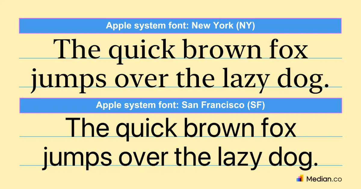
Image content source: Apple
Both of these system fonts are available in weights ranging from Ultralight to Black (see image above). For the SF typeface specifically, widths such as Condensed and Expanded formats are available to choose from.

Image source: Apple
SF Symbols use matching weights, enabling seamless alignment between symbols and text, regardless of size or style.
Apple’s system fonts: Best practices
According to Apple, when it comes to typography, its system is defined by a set of attributes called a ‘text style.’ These built-in text styles let developers provide a consistent way to use typography and hierarchy with font sizes and weights to create a consistent app experience.
Mix these text styles with system fonts to incorporate a Dynamic Type of typography that allows for customization. Adjust text size for a more accessible app experience.
Modify built-text styles by using system APIs, which in turn offer symbolic traits to adjust font characteristics. Bold traits add weight to text, creating another level of hierarchy.
How to add custom fonts in iOS apps
Custom fonts in iOS apps can be used by developers to create a distinctive look and feel to their apps. You can import and embed these fonts within your app’s bundle and use it throughout your app’s UI.
Here’s how you can add custom fonts to your app:
Add the font’s file to your Xcode project. Do this by selecting File > Add Files to “Your Project Name” from the menu bar, or drag your the font file from “Finder” and drop it to your Xcode project.
Register your custom font in the app’s info.plist under “Font provided by application”. Note: UIAppFonts is the raw key name defined by Apple.
Assign your custom font to UI objects such as UILabel (@MainActor class UILabel : UIView) and UITextField. You can assign the UI object’s font to any custom font with the Attribute inspector laid out by Apple.
Use your custom font by source code by first finding the name of your font with the code:
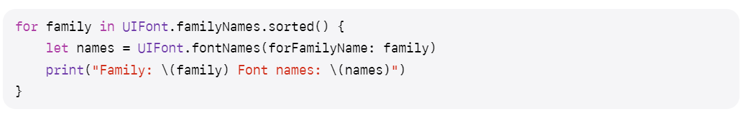
Source: Apple - Adding a custom font to your app
Then, create an instance of your custom font using UIFont (class UIFont : NSObject). For Dynamic Type, use the below code for a scaled instance of your font:
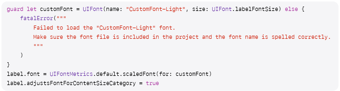
Source: Apple
Apple’s custom fonts: Best practices
Apple emphasizes legibility, and custom fonts are no exception.
Your custom font needs to be easy to read and easily viewable under a variety of conditions and distances. Be careful of the recommended minimum font size of the various styles and weights in font specifications.
Apple’s system fonts automatically support Dynamic Type and respond to accessibility features when turned on — so make sure you incorporate accessibility features to your custom fonts as well.
Apple emphasizes accessibility and your custom fonts need to be accessible or else your app could face rejection from the App Store review team.
Want to learn more about our plugins?
Launch a full-feature native app without native development!

Summary
Typography in iOS and iPadOS apps is key to enhancing user experience and accessibility.
Apple’s regards legibility with a minimum font size of 11 pt as the optimal size for developers to ensure their in-app text is easy to read. Dynamic Type allows for typefaces to adapt to different sizes when users choose to change text-size.
Test your font legibility across Apple’s various platforms your app will be offered in — incorporate system fonts such as the SF or NY fonts or add custom points as per your preference.
Ensure to practice both system font and custom font best practices as laid out by Apple to ensure App Store approval.