

What are Apple’s branding and color UI guidelines? An iOS guide
A powerful app comes with strong branding and a strategic use of color within it. Apple has its own guidelines for branding iOS apps (and the same goes for color use). The main takeaway: Apple emphasizes consistency in voice, tone, and design elements — all while using system colors and testing across multiple devices to ensure compatibility.
Branding and color are two important aspects of an app’s design, be it a webview app, a hybrid app, or a native app.
Learn about Apple’s guidelines on branding our app effectively and color usage for an optimal app user experience.
Branding your app
Branding your app allows you to establish a unique identity that differentiates you from the competition. It is important because it helps with:
Establishing a strong first impression: A good branding strategy helps your app stand out in the App Store. Your logo must be recognizable, while the color scheme and messaging must be consistent to make your app memorable to end users,
Building trust and credibility: A branded app creates a sense of professionalism and establishes your app as high-quality, in turn building trust amongst users. Building trust and loyalty is important to encourage downloads, especially if your app contains in-app purchasing.
Enhancing user engagement: Branding your app with a consistent user interface, marketing materials, and communication methods allows for an easy user experience — leading to user satisfaction and loyalty.
Supporting a marketing strategy: A strong branding strategy makes it easier for you to market your app across various channels. A brand that is consistent, recognizable, and easy to understand can significantly improve your overall promotional campaigns, making it easier to attract new users and maintain app user loyalty.
Enter any URL to build your app
Apple’s guidelines on mobile app branding

Source: Apple’s Human Interface Guidelines on branding for iOS apps
Apple has its own set of branding best practices. Following them can help you boost App Store review time, and help your app get accepted to the App Store. These include:
Voice and tone
Voice and tone are crucial in app branding — they influence how people perceive and interact with your app.
The voice of your app is the personality and style that your app communicates through its messaging. It reflects your app’s values, mission, and overall persona.
The tone of your app is the emotional inflection that complements your voice — this should adapt based on context, audience, or situation. The tone must also adapt to your audience, for instance, new users may expect a welcoming tone whereas previous users may prefer a more direct tone.
Apple expects you to use your brand’s unique voice and tone in every written communication that you display within your app.
Accent color
Accent colors in iOS app branding creates a visually appealing and intuitive user experience. It highlights key elements like buttons, links, and icons, helping users navigate the app, all while staying consistent with your app branding.
For iOS apps, your accent colors should complement your app’s primary color palette — provide contrast to make sure your app is accessible and clear.
Apple emphasizes simplicity and clarity as main focus points of branding, with accent colors, consistency is key. You can specify a color that the system clearly applies to app elements like interface icons, buttons, and text.
Custom font
In branding an iOS app, custom fonts can give your app a personality, enhancing the overall visual appeal of your app and user experience. It also allows your app to stand out in the crowded App Store.
Apple suggests your custom font be legible at all sizes and support accessibility features such as bold text and larger type.
Apple’s system fonts are designed for legibility at small sizes, so it is recommended to mix the use of custom and system fonts. Use custom fonts for headlines and subheadings while keeping the system fonts for body copy and captions.
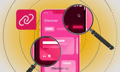
Case Studies
Discover how Median empowers companies to speed mobile app development, engage users, and reduce expenses.
Branding content
You need to have a balanced approach when it comes to branding content for apps — a balance between the use of visuals and textual elements representing your app’s brand identity.
This strategic approach allows you to maintain brand consistency which is a requirement by Apple for iOS apps.
Apple recommends avoiding the use of screen spaces on elements that do nothing but display brand assets (such as logos) — this gives you less space for the content you really need to put out there.
Your branding should be refined and demure in ways that don’t distract people from your experience.
Pattern usage
Pattern usage means establishing design conventions pertaining to the user interface, app navigation, layout and human interactions.
Apple’s pattern usage guidelines are all about comfort. Use standard patterns consistently throughout your app to create a sense of familiarity — this increases your overall app experience for the end users..
Logos
An app’s logo is an important visual representation of your brand, making it a very important iOS app element. Implementing the logo with the correct Apple guidelines will ensure your app’s approval in the App Store.
However, as a good practice, avoid displaying it throughout your app. You don't need to remind users what app they’re using.
Instead, Apple recommends using the extra space in your app to provide users with valuable information and controls to enhance user engagement.
Launch screen
A launch screen on your iOS app appears as soon as an app is opened, providing a seamless transition while the app is loading. The key idea behind the launch screen is to minimize the start-up experience allowing for a smooth app experience.
Because of how the launch screens appear too quickly to include any information other than a welcome message at the beginning of your app experience, avoid using the launch screen as a branding opportunity.
The launch screen need’s to capture the user’s attention and too much of a branded screen will look amateur and visually unappealing.
Apple’s guidelines on color in iOS apps

Source: Apple’s Human Interface Guidelines on color for iOS apps
Color is important in an iOS app’s UI because it enhances the app’s visual hierarchy, improves brand identity, and makes for an accessible app by ensuring readable contrast.
It contributes to your app’s aesthetic appeal and creates an overall user-friendly experience. Let’s look at the best practices Apple suggests for color in iOS and iPadOS apps.
Best practices for iOS app color
Apple’s best practices when it comes to color in iOS apps include:
Color in nongame apps: In nongame apps, overusing color can make your messaging less clear and distract them from the overall app experience. Use color in small amounts to highlight important features.
Using the same color: Consistency is key in Apple apps, avoid using the same colors to highlight different elements within your app, this will only confuse users on what’s important and what’s not.
Ensuring compatibility with light and dark contexts: Make sure that your app’s color is compatible in both light and dark modes for accessibility. Dark Mode enhances visibility by using darker color palettes and increases the overall vibrancy to highlight important features. Keep in mind that system colors will automatically adjust for light and dark contexts.
Test the color scheme under different lightings: The colors on your app may look different when users are outside in the sun vs inside a closed environment with dim lighting. Take a person’s physical surroundings in account and adjust the color scheme accordingly for an optimal visual experience.
Test for multi-device compatibility: Testing your app on multiple devices, especially ones with True Tone display (a display mode that uses ambient light sensors to automatically adjust the white point of the display), is good practice. This is especially helpful for apps with reading content, photos, videos, and gaming where it can control the True Tone display by setting an adaptable white point style.
Consider artwork and translucency effects: Variations in artworks or translucent elements can affect nearby colors, requiring you to make adjustments to maintain a visual consistency and prevent interface elements from overpowering or underwhelming users' visual experience.
Prefer system-provided color controls when applicable: Use built-in color pickers to provide app users a consistent user experience and allow users to save color sets they can easily access from any app.
Want to learn more about our plugins?
Launch a full-feature native app without native development!
Inclusive color best practices
Avoid dependency on color to highlight important information, differentiate between objects, or indicate interactivity. Consider users with color blindness and ensure that the same information is accessible through alternative methods such as labels or shapes.
Avoid colors that make content harder to perceive. An app with low contrast makes icons and texts blend with the background, making it harder to read — especially for people with color blindness.
Also: Make sure that the colors you use in your app send the message you intend. Considering how color is interpreted in other countries and cultures can help clarify your intent.
System color best practices
Some of Apple’s system color strategies:
Avoid hard-coding system colors in your apps because they may change with updates. Instead, use APIs like color to apply system colors which ensures consistency across your app.
Apple has its own sets of dynamic system colors for iOS, iPadOS, visionOS, and macOS that will match the standard UI component color schemes and adapt to light and dark modes.
Dynamic system colors (which can also be patterns) may not be consistent during updates, so avoid replicating them.
Want to know how it all works?
Get hands-on with Median’s comprehensive documentation, and build your app with ease.
iOS and iPadOS platform considerations
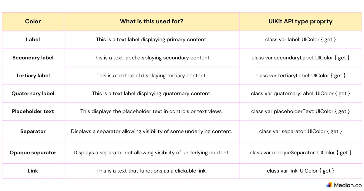
According to Apple, there are two sets of dynamic background colors — system and grouped — for iOS and iPadOS. Both of these background colors come with primary, secondary, and tertiary variants to emphasize information hierarchy.
Apple guides developers to use grouped background colors for grouped table views. These grouped background colors are:
systemGroupedBackground: Main background color of an app’s grouped interface. Its UIKit type property is “class var systemGroupedBackground: UIColor { get }”
secondarySystemGroupedBackground: Color for any content layered on top of the main background of your app’s grouped interface. Its UIKit type property is "class var secondarySystemGroupedBackground: UIColor { get }”
tertiarySystemGroupedBackground): Color for any content layered on top of the secondary background of your app’s grouped interface. Its UIKit type property is “class var tertiarySystemGroupedBackground: UIColor { get }”
Use a system set of background colors for any other views. These system background colors are:
systemBackground: Main background of your app’s interface. Its UIKit type property is “class var systemBackground: UIColor { get }”
secondarySystemBackground: Color for any content layered on top of the main background within your app. Its UIKit type property is “class var secondarySystemBackground: UIColor { get }”
tertiarySystemBackground: Color for any content layered on top of secondary backgrounds within your app. Its UIKit type property is “class var tertiarySystemBackground: UIColor { get }”
With both the system and grouped dynamics, developers must use variants to determine the hierarchy of information. Use these variants to indicate the hierarchy for the flow of information:
Primary: Use this to get an overall view.
Secondary: Use this for grouping content or elements within the overall view of your app
Tertiary: Use this fro grouping content or elements within secondary elements of your app
For foregrounded content, iOS defines dynamic colors with text and other elements being adaptable to different background colors, maintaining readability across various contexts.
Look at the table to see Apple’s definition of the foregrounded content’s dynamic colors.
iOS/ iPadOS color specifications
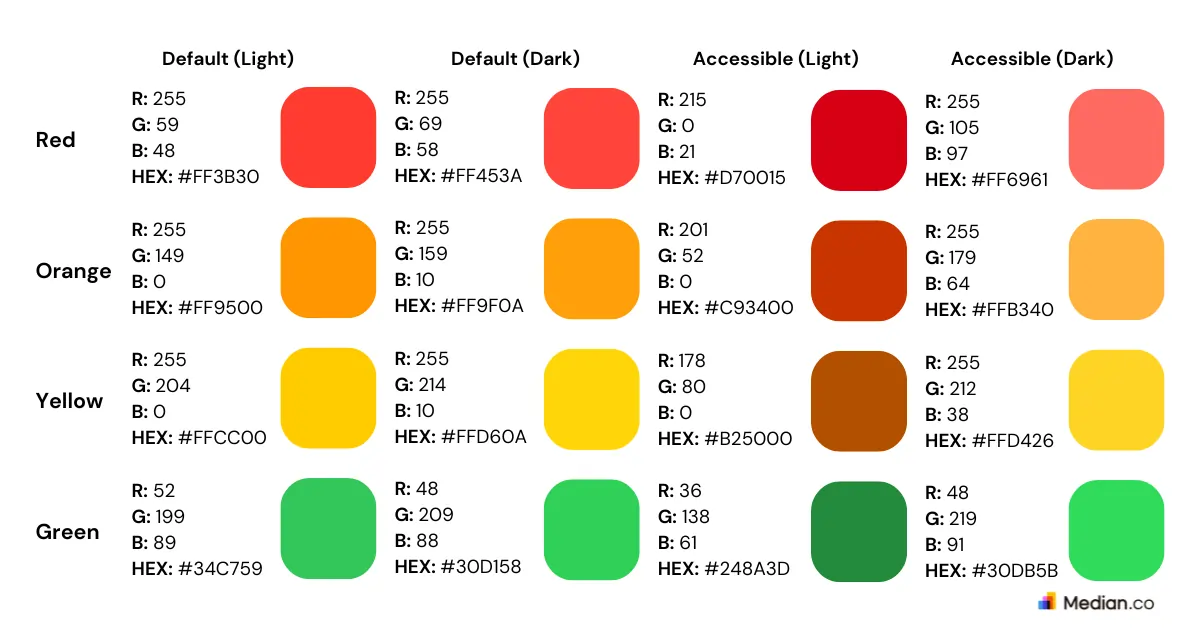
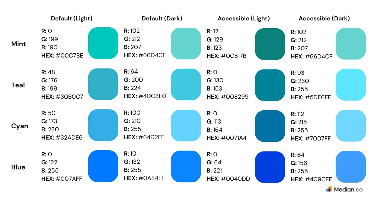
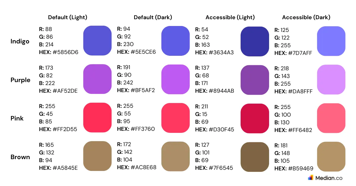
Default system color guidelines
In the image below, the system colors for iOS and iPadOS are being displayed. The SwiftUI API for each color grade are as follows:
Red: This context-dependent red color can be used in many UI elements. It’s SwiftUI API property is “static let red: Color”
Orange: This context-dependent orange color can be used in many UI elements. It’s SwiftUI API property is “static let orange: Color”
Yellow: This context-dependent yellow color can be used in many UI elements. It’s SwiftUI API property is “static let yellow: Color”
Green: This context-dependent green color can be used in many UI elements. It’s SwiftUI API property is “static let green: Color”
Mint: This context-dependent mint color can be used in many UI elements. It’s SwiftUI API property is “static let mint: Color”
Teal: This context-dependent teal color can be used in many UI elements. It’s SwiftUI API property is “static let teal: Color”
Cyan: This context-dependent cyan color can be used in many UI elements. It’s SwiftUI API property is “static let cyan: Color”
Blue: This context-dependent blue color can be used in many UI elements. It’s SwiftUI API property is “static let blue: Color”
Indigo: This context-dependent indigo color can be used in many UI elements. It’s SwiftUI API property is “static let indigo: Color”
Purple: This context-dependent purple color can be used in many UI elements. It’s SwiftUI API property is “static let purple: Color”
Pink: This context-dependent pink color can be used in many UI elements. It’s SwiftUI API property is “static let pink: Color”
Brown: This context-dependent brown color can be used in many UI elements. It’s SwiftUI API property is “static let brown: Color”
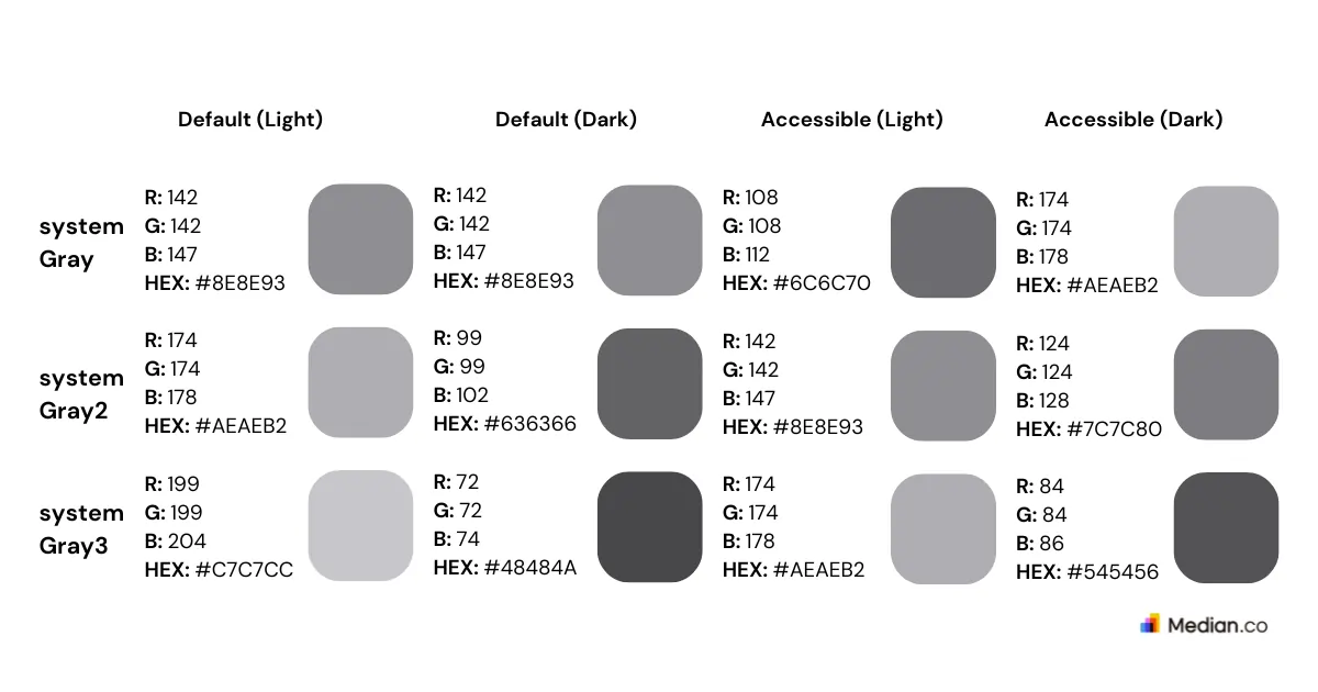
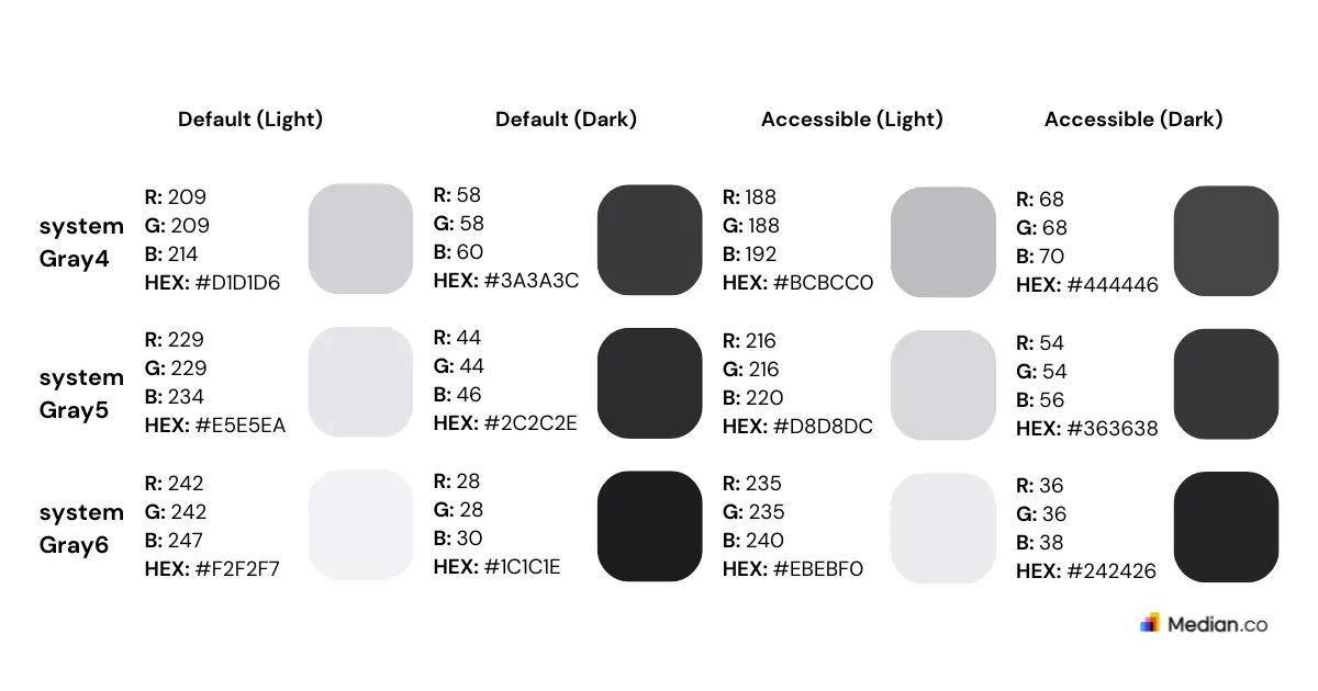
System gray color guidelines
In the image below, the system gray colors for iOS and iPadOS are being displayed. The SwiftUI API for each color grade are as follows:
systemGray: This the standard base gray color and it adapts to the environment. Its Swift API property is “class var systemGray: UIColor { get }”
systemGray2: This the second-level shade of gray color and it adapts to the environment. Its Swift API property is “class var systemGray2: UIColor { get }”
systemGray3: This the third-level shade of gray color and it adapts to the environment. Its Swift API property is “class var systemGray3: UIColor { get }”
systemGray4: This the fourth-level shade of gray color and it adapts to the environment. Its Swift API property is “class var systemGray4: UIColor { get }”
systemGray5: This the fifth-level shade of gray color and it adapts to the environment. Its Swift API property is “class var systemGray5: UIColor { get }”
systemGray6: This the sixth-level shade of gray color and it adapts to the environment. Its Swift API property is “class var systemGray6: UIColor { get }”
Summary
Branding an iOS app is important to ensure your app is unique from the competition. It builds trust amongst users, enhances the overall users engagement, and supports your marketing strategies.
Apple recommends being consistent in voice, tone, custom fonts, and patterns to create a user-friendly experience.
Color is another key aspect of your app’s design. Apple’s guidelines emphasize the use of system, dynamic, and background colors, and ensure that the color within your app is compatible on multiple platforms and devices.
Following these guidelines will make sure your app’s design aligns with Apple's standards, with a higher chance of App Store approval.

Related articles